
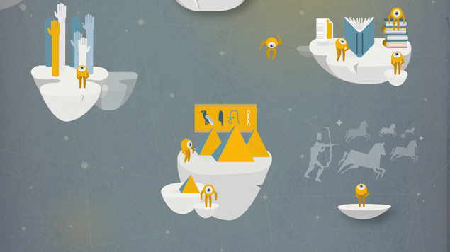
An infographic, by nature, is a visual depiction of any type of data or information.An infographic may help you communicate data in form of such an attractive visual image, whether it’s a study on consumer trends or a step-by-step guide about how to do your clothes.
Visual content is a successful form of communication, but only when done well, whether you’re developing new visuals for your blog, exploring with dynamic statistics, or making your first motion graphic. It takes time, energy, money, and know-how to create effective visual content. While it may be tempted to throw something together and rush it out the door, a great story delivered through captivating, high-quality design is required to genuinely make an effect.
Infographics are a great way to communicate visually. Because they capture our attention and don’t let go, the most aesthetically distinct, imaginative infographics are frequently the most effective.However, it’s worth remembering that an infographic’s images must do more than just entertain and engage. They must assist us in comprehending and remembering the infographic’s material.
What Are the Benefits of Using Infographics?
Infographics are popular at the moment: they’re entertaining, engaging, and simple to share. They also provide numerous advantages for all types of content creators, such as corporations, educators, and organizations.
Marketers may utilize infographics to enhance user engagement, brand awareness, and engagement by using them.
Educators and trainers can just use visualizations to make the students understand difficult topics or to decompose complicated ideas.
Infographics can be used by nonprofits to raise awareness about a cause or social concern.
- Make a single strong focal point.
If you don’t create a single focus point, your infographics will become a jumbled mixture of photos and text. It’s easy to get carried away with an infographic, but the result will be overpowering rather than beneficial.
The infographic will be more effective and the reader will be less confused if you rely largely on one prominent graphic that clearly expresses your overarching subject and message.After you’ve completed the primary visual, you may focus on the details, such as the visuals and information contained.
- For every infographic design, use grids or framework.
Grids and wireframes are the foundation of any design. You can simply organize items and content when you design using a grid. Grid layouts are also important for keeping things and components consistent.When arranging items, for example, you can use the same vertical grid border but instead distance every list item appropriately.
Use a grid design approach to establish margins for your infographic. To reduce visual tension, it’s a smart option to have enough space among your items and the perimeter of your board.A margin can be any size you like in an infographic design, but it’s vital to maintain it constant around the perimeter of your canvases.
- Create a visual narrative.
An infographic’s purpose is to be quick to read, and the design should tell a story. However, they ought to be very visual experiences, so don’t feel obligated to use a lot of text.If someone wants to read it, there should be a small amount of text, but the photographs should be able to convey the main message on their own.
Once you’ve got a working design, try removing the text and showing it to someone who hasn’t seen it before. Can they figure out what’s going on? Is there anything they think you could work on in terms of visual communication to help you deliver the visual story more effectively?
- Know Who You’re Making a Design For
Consider who you’re attempting to reach and what story you’re attempting to tell before you start designing your infographic. Consider the audience: What kinds of material are they used to seeing? What do they have a proclivity for?
When it comes to content, you must still think about the story you’re telling, the brand you’re promoting, and how to best reflect those things. An infographic for a tech company will most likely appear very different than one for a beauty blog.
Colors and illustration style should be determined by the aim of the design, not because you’ve "been really into lucite green recently" or "merely wanted to remind the audience that geometric patterns can determine our souls." (In reality, you should always be able to justify a design decision in terms of how it connects to the aim of your content.)
Make sure your team has well-crafted personalities and a clear creative brief so they can make these judgments citing research rather than whims.
- Think about your distribution platforms when you’re designing.
You need to know not only who you’re designing for, but also where this infographic will be displayed. Is it intended to be shared on Facebook? Is it possible to get it published on the company’s blog? The way people communicate with your content will be highly influenced by these digital settings.Consider all of the locations your infographics could appear to stand out amid the digital void:
What is the largest image size that the blog, landing page, or microsite will allow? Will this be available to view on a mobile device? Prepare your specifications ahead of time.
What social media platforms will be used to advertise this? Various definitions are displayed on Facebook, Twitter, Instagram, and Pinterest.
Is it possible that it will be printed? If this is the case, the color game has changed. For web, use RGB; for print, use CMYK.
What is the best option for a resolution? So, here’s the deal: Web resolution is 72 dpi, retina screens are 150 dpi, and print resolution is 300 dpi.
- Best Practices for Infographic Design
Even before they read the title, the first visual effect of your infographic will draw or repel readers. According to MIT, people can digest visual input in just 13 milliseconds. Because first impressions are so important, every part of the design must be flawless. (Yes, even experienced designers may make beginner errors.) Pay great attention to the following:
White space and alignment: The eye requires a visual break, so use it wisely. It’s also critical to maintain a consistent separation pattern. Grids and baselines allow the viewer’s eye to focus on, appreciate, and assimilate each element of your infographic.
- Make Your Data Visualization a Success
Excellent design may attract people and entice them to connect with your material, but it is credibility that motivates them to spread it. That is why precise data representation is so critical. When a chart is wrong, the reader loses faith in the content.
However, successful data visualization is much more than just accurately showing data. It’s all about how well you do it. People will quickly abandon a graph or chart that is too complex or perplexing to understand.
- Keep an Eye on Your Length
The era of the never-ending infographic is finished. People seek useful content, but length does not always equate to usefulness. In reality, according to a 2017 Demand Gen Report, 46% of respondents prefer shorter content.
If you don’t know what and how to cut from your material, it’s typically because you’re wanted to show many such tales in one. In these circumstances, either make your infographic a single narrative or turn it into a series of infographics. Here are some of our favorite examples of infographic design that do this well if you need some ideas.
- Modular Pieces of Design
We adore innovative infographic layout, but creating modularly is a sensible and cost-effective method to make the most of the available space. It makes it easy to separate your infographic into teaser photos to share on social media, utilize in blogs, or send to a publication because it helps generate an intuitive feeling of hierarchy. These assets are extremely beneficial to your distribution crew.
Pro tip: Have these assets ready to go in the right dimensions and quality when you launch. Use this infographic to learn how to size photographs for each social media platform.
- Everything should be optimized.
We can’t tell you however many people overlook this important step when creating infographic for SEO. To achieve the greatest traffic and shares, your infographic, landing page, and blogging must all be customized.This entails incorporating relevant keywords into filenames, headers, pictures, URLs, and blog copy. Remember to include (and test!) social sharing icons on your website.
Learn how to improve your blog and use this handy checklist to make sure everything is in order before hitting publish.